
TL;DR:
- Effective form design prioritizes accessibility requirements like clear labels, proper contrast, and logical navigation to reduce drop-off rates and usability issues. Incorporating verifiable, evidence-based practices such as real-time error feedback, consistent testing, and design system integration ensures forms serve all users efficiently. Ongoing iteration and systematic validation help maintain high standards of accessibility, usability, and compliance at scale across products.
Digital forms are among the most failure-prone touchpoints in any product interface; users abandon them, misinterpret them, and encounter errors that feel punitive rather than helpful. Research consistently links poor form UX to elevated drop-off rates, accessibility failures, and eroded trust. This guide translates peer-reviewed findings and established UX evidence into a structured, actionable process for designers who want to build forms that perform well across all users, including those relying on assistive technologies. From accessibility foundations to iterative testing protocols, every recommendation here is grounded in verifiable evidence rather than convention or guesswork.
Table of Contents
- Know your requirements: Accessibility and UX foundations
- Step-by-step form design: Structure, flow, and field types
- Error prevention, messaging, and accessible feedback
- Verify and optimize: Testing your form UX
- A fresh take: Where most form UX guides miss the mark
- Explore more: Elevate your form UX with DesignDex
- Frequently asked questions
Key Takeaways
| Point | Details |
|---|---|
| Accessibility is essential | Meeting WCAG requirements ensures forms are usable for everyone, including people with disabilities. |
| Structure fields logically | A thoughtful layout and sequencing reduce user frustration and errors. |
| Error feedback matters | Clear, multimodal error messaging supports all users and speeds recovery. |
| Test and iterate | Regular usability and accessibility testing drives continuous improvement in form design. |
Know your requirements: Accessibility and UX foundations
Effective form design begins before a single field is placed on a canvas. Establishing a clear baseline of accessibility and UX requirements prevents costly rework and ensures that the resulting interface serves the broadest possible user population from the outset.
The Web Content Accessibility Guidelines (WCAG) define several non-negotiable thresholds for form components. WCAG contrast thresholds set a minimum 4.5:1 ratio for normal text, ensuring that labels, placeholder text, and error messages remain legible for users with low vision or color deficiencies. Contrast alone, however, does not constitute full accessibility compliance; the structural and interactive dimensions of forms carry equal weight.
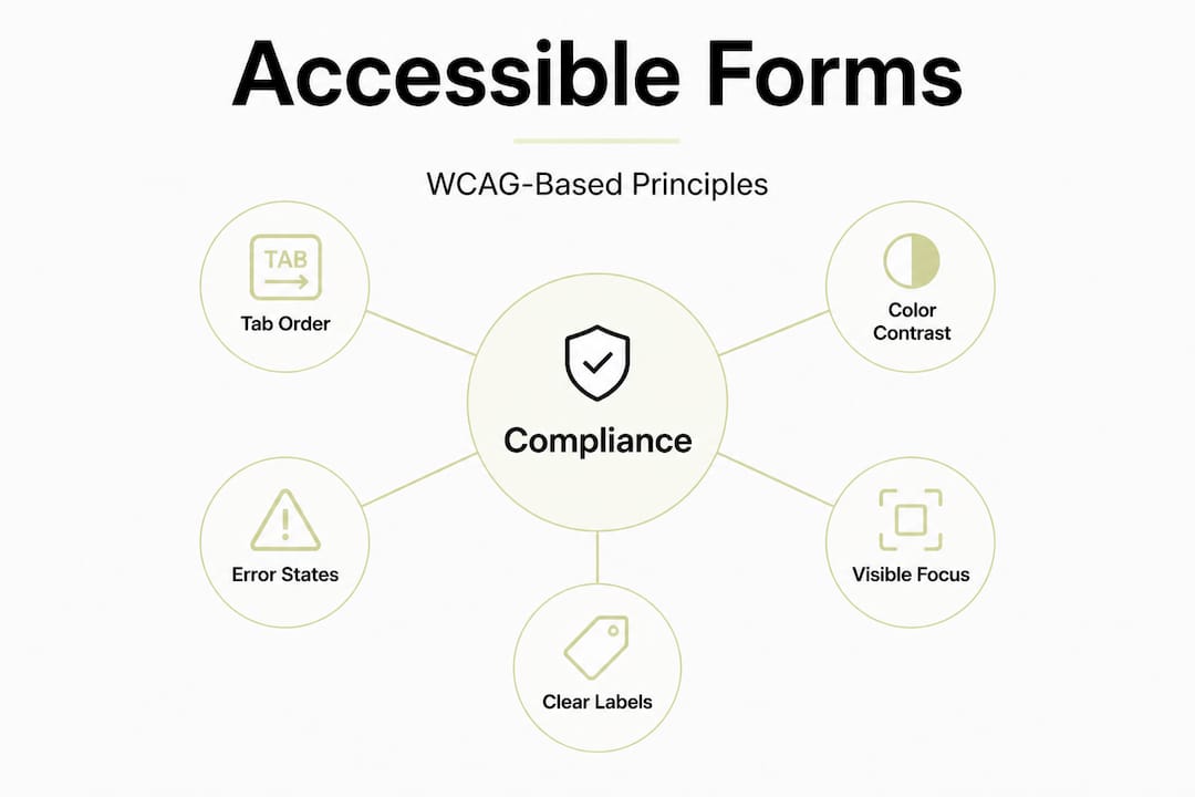
Accessible form design principles make clear that logical tab order, visible focus states, adequate contrast, and error messages that do not rely on color alone form the interconnected core of compliant, user-friendly forms. These elements also align directly with human-centered design tips that prioritize cognitive ease and equitable access across ability levels.
The following table summarizes the key WCAG requirements most directly applicable to form design:
| Requirement | WCAG criterion | Minimum standard |
|---|---|---|
| Text contrast ratio | 1.4.3 | 4.5:1 for normal text |
| Focus visibility | 2.4.7 | Visible focus indicator required |
| Tab order | 2.4.3 | Logical, sequential navigation |
| Error identification | 3.3.1 | Text description required |
| Label association | 1.3.1 | Programmatic label-to-field linkage |
Beyond these tabular requirements, several accessibility pitfalls appear with notable frequency in real-world form audits:
- Placeholder text as labels: Placeholder text disappears on input, removing context and creating memory demands that impair usability, particularly for users with cognitive disabilities.
- Color-only error indicators: Highlighting a field border in red without accompanying text fails users with color vision deficiencies and violates WCAG 1.4.1.
- Missing ARIA-live regions: Dynamic inline errors that are not announced by screen readers create silent failures for blind or low-vision users.
- Insufficient focus ring contrast: A default browser focus ring is frequently overridden by CSS resets, leaving keyboard users with no visible navigation cue.
- Auto-advancing fields: Automatically jumping to the next field on input completion removes user control and can disorient screen reader users.
Integrating these requirements early also supports design system consistency, reducing duplicated effort when accessibility-compliant form components are standardized across a product or organization.
Statistic callout: Studies from accessibility auditing bodies consistently find that form-related issues account for the largest category of WCAG failures on commercial websites, with missing labels and inadequate error messaging appearing in over 60% of audited forms.
Step-by-step form design: Structure, flow, and field types
With foundational requirements clearly scoped, the process moves to practical, sequential form construction. Structure and field selection are the most direct levers available for reducing cognitive load and completion friction.
Follow these steps when building a form from the ground up:
- Map the information architecture first. List every data point the form must collect, then group related fields thematically (for example: personal details, contact preferences, payment). This grouping drives both visual organization and logical tab sequencing.
- Sequence fields by cognitive complexity. Place low-effort fields (name, email) before high-effort ones (date of birth, account number). Users who build early momentum are measurably more likely to complete longer forms.
- Adopt a single-column layout as the default. Research into reading patterns indicates that single-column forms reduce tab-order confusion and eye-tracking complexity compared to multi-column alternatives. Multi-column layouts are acceptable only for closely related paired fields, such as first name and last name.
- Select input types that match the data context. A date field should use a date picker or structured input (DD/MM/YYYY with separate fields) rather than a freeform text input. Phone number fields benefit from numeric keyboard triggers on mobile. Selecting the correct HTML input type (tel, email, number) both reduces user error and enables browser-level validation.
- Apply visible, persistent labels above every field. Floating labels that animate above the input can work when implemented carefully, but top-aligned static labels consistently outperform placeholder-only approaches in eye-tracking studies measuring scan path and completion time.
- Group related fields with visual containers or white space. Grouping signals logical relationships, reduces perceived form length, and supports interaction design principles around proximity and chunking.
- Validate your structural decisions before visual polish. Running a design validation strategy early, such as a cognitive walkthrough with representative users, catches structural problems before they are baked into a high-fidelity prototype.
The table below compares single-column and multi-column form layouts across common evaluation dimensions:
| Dimension | Single-column | Multi-column |
|---|---|---|
| Tab order clarity | High | Medium to low |
| Mobile responsiveness | Excellent | Requires rework |
| Cognitive load | Low | Higher |
| Scan path predictability | Linear, predictable | Variable |
| Recommended use case | Most forms | Tightly paired fields only |
Logical tab order and focus visibility directly improve both UX and accessibility compliance, meaning structural decisions about column layout have downstream effects on testable WCAG criteria.
Pro Tip: Test your field labels with users who are unfamiliar with your product domain. If they pause for more than two seconds interpreting a label, it needs revision. Clarity beats brevity every time when the goal is completion rather than aesthetic minimalism.
Error prevention, messaging, and accessible feedback
After structuring and field selection are resolved, the next critical layer is error handling. Forms generate errors inevitably; the design of error states determines whether users recover quickly or abandon the interaction entirely.
Predictable, well-placed error states reduce recovery time by orienting users immediately to the source and nature of the problem. Research from design analysis in UX consistently shows that unclear or delayed error feedback is among the top contributors to form abandonment across e-commerce, registration, and data-entry contexts.

Error messages that do not rely on color alone and that are announced by screen readers represent the technical and ethical minimum for accessible error handling. In practice, this means combining three distinct channels simultaneously: color change (red border or red text), iconography (an alert icon adjacent to the field), and explicit text description ("Please enter a valid email address"). Relying on any single channel excludes a segment of your user base.
Best practices for error handling in forms:
- Inline, real-time validation: Validate fields immediately after focus leaves (on blur), not only on submit. This distributes error correction throughout the completion process rather than presenting a single overwhelming list at the end.
- Clear, actionable error language: State what went wrong and how to fix it. "Invalid input" provides no recovery path. "Enter a 10-digit phone number without spaces" does.
- Preserve valid user input: Never clear a field that contains valid data when an adjacent field fails validation. Losing correctly entered data is one of the most frustrating form experiences users report.
- Scroll and focus to errors on submit: When form-level validation runs on submit, move keyboard focus and scroll position to the first error so users know exactly where to begin correcting.
- ARIA-live regions for dynamic feedback: Assign "aria-live="assertive"` to error containers so screen readers announce errors immediately without requiring the user to navigate back to the field.
- Associate errors programmatically with fields: Use
aria-describedbyto link error messages to their corresponding input elements, enabling assistive technologies to surface the error message when the field receives focus.
Validating form design at the error-state level requires testing with both automated tools and real users relying on screen readers, because automated checks cannot fully capture the quality of the announced feedback experience.
Pro Tip: Combine color, iconography, and explicit text in every error state, regardless of how obvious the error seems. Users under cognitive load, time pressure, or using assistive technology need all three channels simultaneously to recover efficiently.
Critical accessibility reminder: WCAG 1.4.1 and 3.3.1 together require that errors are distinguishable without relying on sensory characteristics alone and that the error is described in text. Non-compliance with either criterion creates legally actionable accessibility failures in many jurisdictions, not merely a UX inconvenience.
Verify and optimize: Testing your form UX
Once error handling is robust and the form structure is finalized, the verification phase determines whether the design achieves its intended usability and accessibility outcomes in practice. Testing is not a one-time gate; it is an iterative process integrated throughout the design lifecycle.
Logical tab order, visible focus, and error states are all testable for accessibility compliance, meaning that structured testing can confirm whether the form meets WCAG thresholds before release. A pre-launch verification checklist should include at minimum:
- Tab through the entire form using only a keyboard; confirm that focus is visible at all times and that sequence follows a logical, left-to-right, top-to-bottom path
- Activate a screen reader (NVDA, JAWS, or VoiceOver) and complete the form from start to submit; confirm that all labels, hints, and error messages are announced correctly
- Test contrast ratios for all text, labels, and UI states (default, focus, error, disabled) using a tool such as the WebAIM Contrast Checker or browser DevTools
- Submit the form with intentionally invalid inputs and verify that errors are announced, visible, and associated with the correct fields
- Resize the viewport to mobile breakpoints and confirm that single-column layout integrity, touch target sizes (minimum 44x44px per WCAG 2.5.5), and keyboard triggering are intact
- Run automated accessibility audits using axe DevTools or Lighthouse; resolve all automatically detectable issues before proceeding to manual testing
Usability testing with real representative users adds dimensions that automated tools cannot detect. Observing five to eight users completing target tasks on a form yields sufficient signal to identify the majority of critical usability issues, according to established usability testing research. Prioritize participants who represent the range of ability levels, device types, and familiarity with the task domain that your actual user base includes.
Iterative improvement distinguishes high-performing form design from one-time deliverables. Each round of testing should produce a prioritized list of issues ranked by severity (blocking, significant, cosmetic) and effort to remediate. Scheduling a second test round after remediation confirms that fixes resolved the intended problems without introducing regressions.
Applying product design best practices and human-centered principles to the testing phase means treating test participants as co-designers rather than evaluators; their behavior reveals unmet needs that specifications cannot anticipate.
Statistic callout: Research cited in usability testing literature indicates that forms with iterative testing cycles integrated across at least two design stages show measurably lower error rates and higher task completion rates than those validated only at the end of development.
Pro Tip: Retest after every major design change, not only after the initial build. A navigation restructure, a new design system token, or a revised error message template can all introduce regressions in tab order, contrast, or ARIA markup that were previously compliant.
A fresh take: Where most form UX guides miss the mark
Most form design guides cover the surface: keep it short, use clear labels, avoid unnecessary fields. That is useful but incomplete. What the majority of available resources consistently underemphasize is the intersection of accessibility compliance, systematic testing, and design system integration as a unified practice rather than three separate concerns.
The common failure pattern is treating accessibility as a final checklist rather than a structural constraint that shapes every decision from the first wireframe. When human factors in design are applied retrospectively, they generate expensive remediation cycles. When they are applied upstream, at the information architecture and component selection stages, they eliminate entire categories of defects before they exist.
The second overlooked factor is iteration velocity. Guides present form design as a linear process ending at launch. In practice, forms that serve users well are tested, revised, retested, and refined across their entire operational lifespan. A registration form that performed well at launch may fail when user demographics shift, when the underlying platform changes, or when an adjacent design system update alters focus styling globally.
Third, and most practically, form components built inside a well-governed design system carry accessibility compliance forward automatically. When a validated, ARIA-annotated text input component is published at the system level, every designer who uses it inherits its accessibility properties without additional effort. This is not merely an efficiency argument; it is a quality consistency argument. The alternative, individual designers implementing ARIA handling independently, produces uneven outcomes at scale.
The evidence-backed process described in this guide works precisely because it integrates these three dimensions: accessibility as a structural requirement, testing as an ongoing practice, and design system governance as a force multiplier for compliance at scale.
Explore more: Elevate your form UX with DesignDex
Form UX is an evolving field, and keeping pace with the research requires more than periodic reading.
DesignDex aggregates and distills peer-reviewed UX studies into structured, citation-ready breakdowns so you can justify every design decision with evidence. Explore research on VR immersion and user empathy to understand how emerging interaction paradigms affect form-based experiences, or review the usability testing research study directly to ground your testing protocols in published methodology. The full DesignDex research hub surfaces daily updates across usability, accessibility, interaction design, and industrial design so your practice stays current without requiring you to monitor dozens of academic journals independently.
Frequently asked questions
What is the WCAG contrast ratio for forms?
WCAG requires a minimum 4.5:1 ratio for normal text on forms, including labels, hint text, and error messages, to ensure readability for users with low vision or color deficiencies.
How can error messages improve accessibility?
Error messages should combine text description, iconography, and color change simultaneously, and use ARIA-live to announce errors to screen readers without requiring manual navigation back to the affected field.
Why is logical tab order important in form design?
Logical tab order allows users, including those with motor disabilities who rely exclusively on keyboard navigation, to move through form fields in a predictable, sequential sequence without disorientation or skipped fields.
What is ARIA-live and how does it help in form UX?
ARIA-live is an HTML attribute that instructs screen readers to announce dynamic content changes, such as inline validation errors, immediately upon occurrence so that assistive technology users receive the same real-time feedback as sighted users.